It’s The Final Countdown! That Means New Graphics and Critical Feedback.
As the end of our AR project draws closer, the remainder of what needs to be done becomes clearer. While a lot of the work we have developed has been finalized, this past month has shown areas of our experience that still need to be ironed out. While I’ve already worked towards these needed improvements in certain areas, the past week has shed some light on what’s still left.
A Fresh Coat of Paint for the Information Graphics
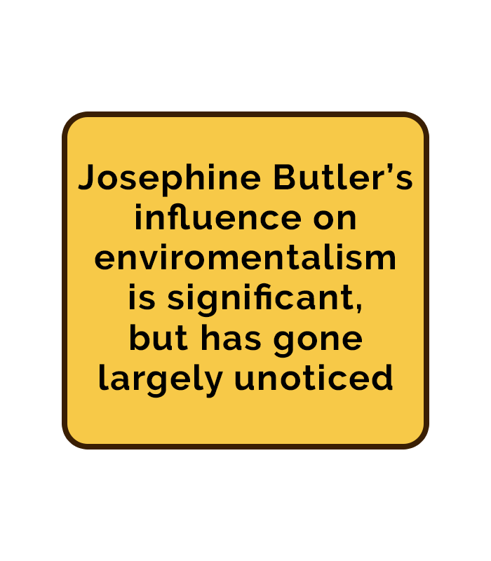
An important aspect of our experience that needed improvement was the informational text boxes. It was brought to my attention by the team at Hoverlay that changes needed to be made to the color and text for the graphics. While the old graphics fit the 51 Steps to Freedom aesthetic, they also proved to be hard for users to read. To address this, I started with choosing a simpler, more eye-pleasing design. After experimenting with random colors, I landed on a light yellow background with a dark brown border. And with the addition of simple black text, this proved to be the best combination for our new graphics.
Main Menu Graphics
Along with creating newly improved text boxes, I was also tasked with creating graphics for our main menu. Not only did this mean designing unique buttons apart from the previously made graphics, but it also meant creating a sort of logo for our experience. I brainstormed some ideas with my team and went to work. Eventually, I came up with a design that combined the 51 Steps logo with a picture of Josephine Butler. I wanted this graphic to be in the style of a street sign, à la Sesame Street. I think that this graphic turned out really well, especially since I feel like it matches well with the text boxes already within our experience.
New Feedback from the Hoverlay Team

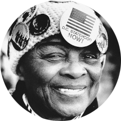
The previous week proved to be one of the most eye-opening moments for our group. This was because we had our second meeting with Hoverlay, where many members from their team would test and provide feedback on our experiences. As a representative for my group, I was presented with a lot of important critiques that needed to be addressed. One of the most important matters that was requested was to provide a better understanding of what to do in the experience. They explained that users could easily become lost within our space if there’s a lack of guidance. I bounced around a few ideas and then ultimately pitched the concept of adding graphics that would help visualize to users how to interact with the environment. Along with voice-over, these examples could include photos of people taking a picture with our Josephine Butler statue, or a picture of her beanie to better explain the impact of the pinback buttons. This idea was met with approval and has now become a large focus for our team to develop during the last few weeks we have.
Seeing What Works Through User Testing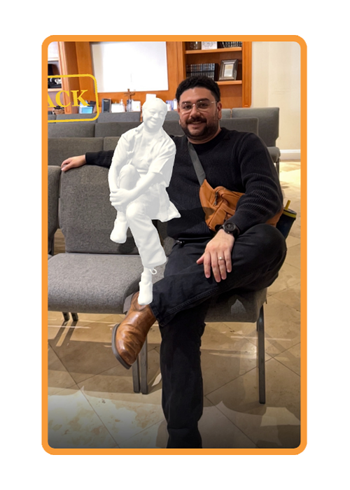
Along with the feedback from Hoverlay, we also sought out opinions from future users of our experience. Specifically, people who have not interacted much with AR. These opinions were compiled from the User Testing I conducted on individuals from my church. These people varied in age, from 25 to 65, and proved to be the best candidates to be given tasks to properly test our experience. I didn’t know what to really expect from these tests, except for some feedback on where to improve. But it ended up being the perfect showcase of how people will really interact with our AR space. Some users didn’t know how to return to the main menu. Others didn’t realize that they had to walk around the head bust of Josephine Butler. But overall, they really enjoyed being placed in an immersive experience. All of this testing proved to be incredibly important as it brought areas needing improvement to light that we normally wouldn’t have gotten through discussions with Hoverlay. Moving forward into our last few weeks, it’s now clear what our team needs to do to bring this project to a nice close.